
Linocut Illustration — Eighteen Park (Brisbane Real Estate)
Eighteen Park web landing page with custom linocut illustrated print of the Brisbane River
Project Scope & Deliverables
Client: Theola (for Eighteen Park)
Project Scope: Property Development, Placebranding, Custom Asset Library & Marketing Illustration
Medium & Style: Linocut Print Illustration, supplied as hand-printed bespoke linocut prints and in a digital format (Adobe Photoshop)
Client Location: Brisbane, Queensland, Australia
Studio Base: Melbourne, Victoria
The Challenge: Humanising a High-End Development
Commissioned by Theola, a premier Brisbane marketing agency, the objective was to create a distinctive visual identity for a new property project, the Eighteen Park development.
In a highly competitive property market dominated by cold, sterile digital renders, the real challenge was to humanise the project. The client required specialised illustrators and graphic designers who could move beyond standard pixel-perfect layouts to capture the actual soul of Brisbane’s natural beauty—the massive Moreton Bay figs, the vibrant jacarandas, and the river. The goal was to build an immediate emotional connection with potential buyers by using an artistic medium that naturally suggests longevity, craftsmanship, and local heritage.
The Solution: A Bespoke Linocut Brand Library
To break away from the standard corporate look, I developed a comprehensive library of custom illustrations and physical bespoke linocut prints that became the artistic heartbeat of Eighteen Park’s marketing campaign.
By leaning into the traditional, analogue feel of hand-carved textures—bridging the gap between the tactile world of fine-art illustrators and the technical precision of graphic designers—I created a highly versatile visual system. These assets scaled seamlessly from high-impact physical signage and premium print brochures right through to immersive digital and social media campaigns. Operating as an off-site art department, I made sure these handcrafted elements functioned as a sophisticated bridge between the modern architecture and the surrounding biodiversity, ultimately elevating the development's brand perception into something genuinely unique.


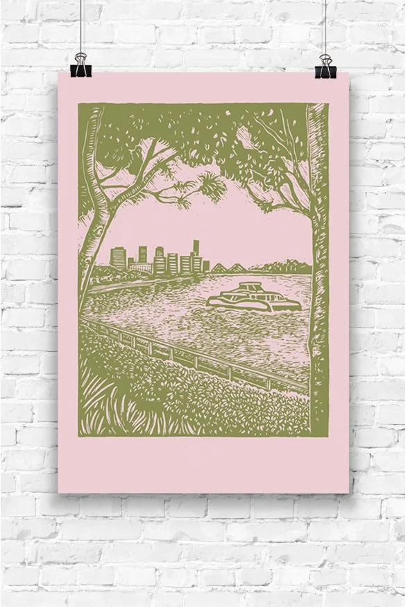
A linocut print of the Brisbane River