Minimalist Brand Identity & On-Site Signage — Space& Architecture and Interiors

Logo design and branding Space &
The Challenge: Translating Mid-Century Minimalism for a Modern Studio
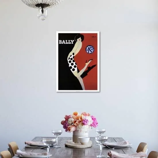
Collaborating with Elizabeth Giorgio, founder of Space& Architecture and Interiors, the objective was to develop a distinctive on-site identity that balanced vintage charm with modernist precision. The creative spark was inspired by the iconic 20th-century Bally posters by Bernard Villemot. The challenge lay in adapting Villemot’s "faceless" elegance—characterised by bold shapes and expressive silhouettes—into a contemporary visual language that reflected the studio’s architectural philosophy: clean lines, negative space, and refined colour palettes.
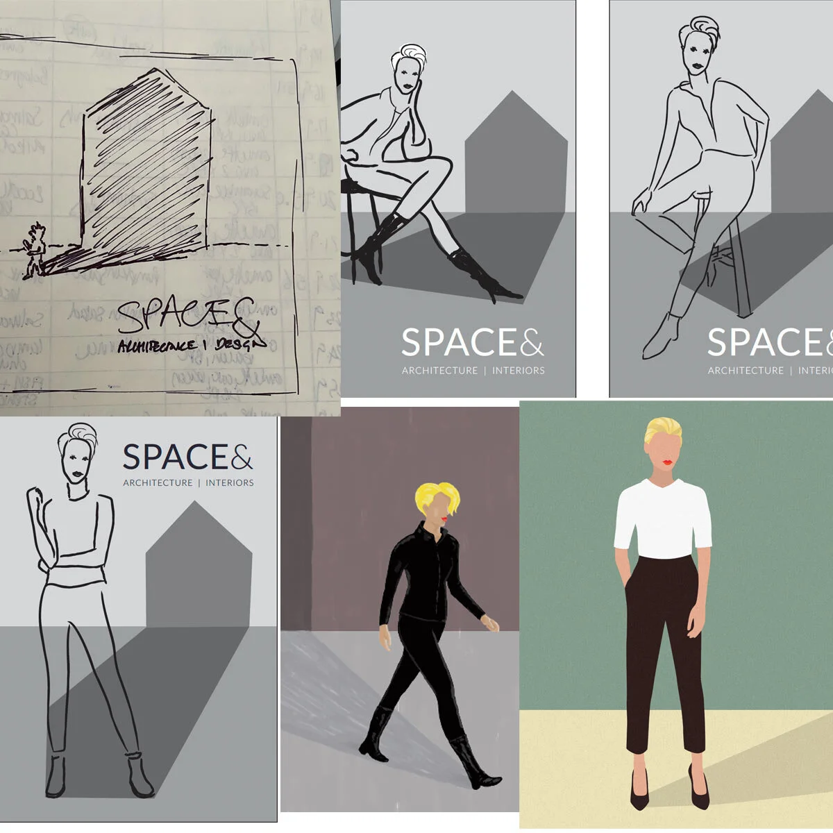
The Solution: A Modernist Visual Anchor
I developed a logo and on-site signage system centred around a bespoke, minimalist illustration. By stripping away facial detail and focusing on form and shadow, I created a sophisticated visual anchor that feels both timeless and avant-garde. The final design utilises clean sans-serif typography and a strategic "Modernist" colour scheme, optimised for high-visibility on-site signage. This project demonstrates my ability to act as a visual researcher and translator, taking complex historical art references and refining them into a functional, high-end brand system for the design and architecture industry.